Creative3 Bloq, By Daniel Piper, March 20, 2023
Is the new "We ❤️ NY" logo really that bad?
Main differences - the typeface is changed from the famous Milton Glaser deigned logo with serif font to a corporate looking sans serif font. The heart in the new logo has a slight shading, with some saying it more closely resembles the heart emoji. The new one looks out of balance to my eye, with the large hesrt way over on the side. Some have complained it looks like it's saying "We NYC love" I can see their point. My only issue with the old logo is not that the font is serif (I like serifs, as you'll find out), but that the serif's style is so long and rounded it screams out 70's to me. The 1974 typeface American Typewriter to be exact.
The new 'We ❤️ NYC' campaign has sent the internet into a frenzy
Gothamist, by Elizabeth Kim, Mar 20, 2023
New Yorkers On New 'We Love NYC' Logo: We Hate It
Matt Troutman, Patch staff
Posted Mon, Mar 20, 2023
The funniest and most New York take here.
In my view, this is part of a bigger trend, where all graphic design, print and digital, is going toward sans serif typefaces. Especially in digital, ALL digital is now or will soon be all sans serif. Why?
The state department just mandated all official documents to change from using Times New Roman to Calibri. Serif to Sans Serif.. The reason given is readability, especially for dyslexic readers. I'm not so sure.
I think the general trend is more simple, and it troubles me a bit. It seems to me that people are just associating serif with 'old fashioned' and sans serif with 'modern'. I don't dislike sans serif typefaces, though I do hate Helvetica, which is what the new logo has. I just don't want everything to be sans serif. I don't find it easier to read. I would like very much like to preserve the variety and the diversity of typeface styles.
I like Times New Roman, though to many graphic designers it looks old fashioned. I admit also I am a bit prejudiced from working in a printing company and seeing how sans serif typefaces, especially Helvetica, are far more troublesome in processing. Times New Roman is just more reliable iin terms of printing.
PRO SANS SERIF ARTICLES/VIDEOS
article
The Rise of the Sans Serif
Laura Keung
Last updated Dec 2, 2020
Basically arguing "Why Sans Serif is so Great!"
The Rise of the Sans Serif
Envato Tuts 2021
Embed
<iframe width="560" height="315" src="https://www.youtube.com/embed/dYrzYnx4Dr4" title="YouTube video player" frameborder="0" allow="accelerometer; autoplay; clipboard-write; encrypted-media; gyroscope; picture-in-picture; web-share" allowfullscreen></iframe>
MORE SKEPTICAL ABOUT SANS SERIF
article
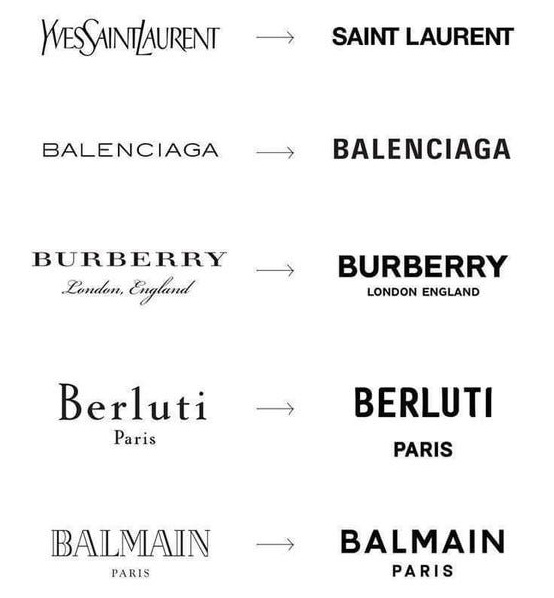
Logo Wars: the Sans Serif Epidemic and the Paradox of Modern Luxury
written by Shze Hui Tjoa and Foivos Dousos. March 2019
Medium.com
No comments:
Post a Comment