Looking forward and looking back tp 2010. With luck, in 2024, I'll be doing some looking back and looking forward on this blog in the coming months.
 |
| Janus Day, January 1, 2010 |

Looking forward and looking back tp 2010. With luck, in 2024, I'll be doing some looking back and looking forward on this blog in the coming months.
|
| Janus Day, January 1, 2010 |
A rare video on the subject of lead came, from an unusual place - 18th century Jamestown in Virginia, USA. Finding stamped text in the milling marks of lead came is fairly rare, and is limited to England from 16th to 19th century (Linda?). I'd never heard of this elsewhere in America. I've certainly never come across a lead with these kind of milling marks, as all of the panels I've worked on are from the 19th to 21st centuries.
What Secret Can Window Lead Reveal? – Dig Deeper, Episode 38
JamestownRediscovery, 2021 - 11:41
Here are a few other links -
Window Lead: from Jamestown Discovery
Cover by Abe Birnbaum (1899-1966)
The New Yorker - April 12, 1952
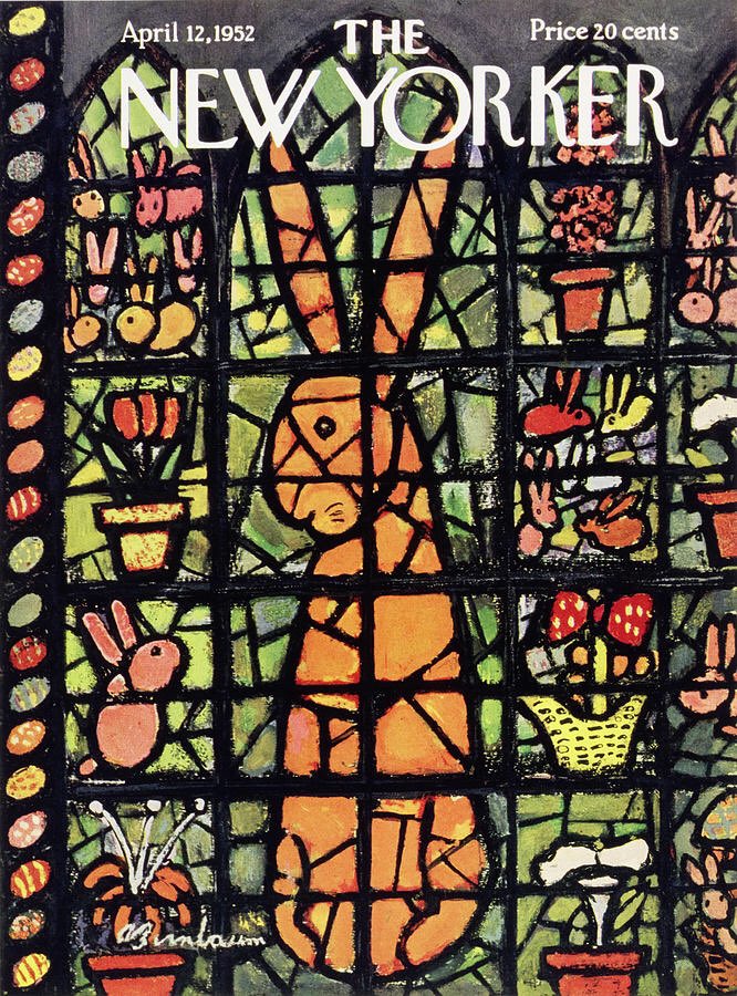
The only info on the web about Birnbaum is the New York Times obituary on Abe Birnbaum.
ABE BIRNBAUM, 67, ILLUSTRATOR, DIES; Drew Nearly 200 Covers for The New Yorker
Again, needs subscription to see article.
The only info not behind a paywall I could find about him is this quote -
“Nothing is ugly. Everything is what it is.”
I wonder whether this cover would be controversial if published today?
Maybe, but probably not as controversial as the cover by Art Spiegelman -
New Yorker cover Spiegelman IRS crucifies Easter bunny 4/17 1995
Anyone who knows me and my art knows that I'm a sucker for this kind of thing. I like the Plein Air stuff especially.
Making a Masterpiece... with a Vintage Typewriter
Great Big Story
March 2023
Nice photo essay on stained glass artist Nathalie Hildegarde Liege from Shropshire, England. I like when the show the whole studio, including tools and materials. Doesn't show much of her work though. She does not appear to have a website, but she does have an Instagram account.
Shining a light on a stained glass artist – in pictures
The Guardian
Christopher Thomond
March 24, 2023
 |
When people entered these churches they couldn’t read and so visitors were told a story in glass like a cartoon tells it, with sections in windows. From window to window you follow the story and to me it felt like a contemporary story as I love reading stories told to children using illustrations. I now approach my stained glass as storytelling too. Sainte-Chapelle has a very spiritual side to it as well as a very special site where you play with light to find peace and think of the beauty of life and how we are all part of it as one.
Creative3 Bloq, By Daniel Piper, March 20, 2023
Is the new "We ❤️ NY" logo really that bad?
Main differences - the typeface is changed from the famous Milton Glaser deigned logo with serif font to a corporate looking sans serif font. The heart in the new logo has a slight shading, with some saying it more closely resembles the heart emoji. The new one looks out of balance to my eye, with the large hesrt way over on the side. Some have complained it looks like it's saying "We NYC love" I can see their point. My only issue with the old logo is not that the font is serif (I like serifs, as you'll find out), but that the serif's style is so long and rounded it screams out 70's to me. The 1974 typeface American Typewriter to be exact.

The new 'We ❤️ NYC' campaign has sent the internet into a frenzy
Gothamist, by Elizabeth Kim, Mar 20, 2023
New Yorkers On New 'We Love NYC' Logo: We Hate It
Matt Troutman, Patch staff
Posted Mon, Mar 20, 2023
The funniest and most New York take here.
In my view, this is part of a bigger trend, where all graphic design, print and digital, is going toward sans serif typefaces. Especially in digital, ALL digital is now or will soon be all sans serif. Why?
The state department just mandated all official documents to change from using Times New Roman to Calibri. Serif to Sans Serif.. The reason given is readability, especially for dyslexic readers. I'm not so sure.
I think the general trend is more simple, and it troubles me a bit. It seems to me that people are just associating serif with 'old fashioned' and sans serif with 'modern'. I don't dislike sans serif typefaces, though I do hate Helvetica, which is what the new logo has. I just don't want everything to be sans serif. I don't find it easier to read. I would like very much like to preserve the variety and the diversity of typeface styles.
I like Times New Roman, though to many graphic designers it looks old fashioned. I admit also I am a bit prejudiced from working in a printing company and seeing how sans serif typefaces, especially Helvetica, are far more troublesome in processing. Times New Roman is just more reliable iin terms of printing.
PRO SANS SERIF ARTICLES/VIDEOS
article
The Rise of the Sans Serif
Laura Keung
Last updated Dec 2, 2020
Basically arguing "Why Sans Serif is so Great!"
The Rise of the Sans Serif
Envato Tuts 2021
Embed
<iframe width="560" height="315" src="https://www.youtube.com/embed/dYrzYnx4Dr4" title="YouTube video player" frameborder="0" allow="accelerometer; autoplay; clipboard-write; encrypted-media; gyroscope; picture-in-picture; web-share" allowfullscreen></iframe>
MORE SKEPTICAL ABOUT SANS SERIF
article
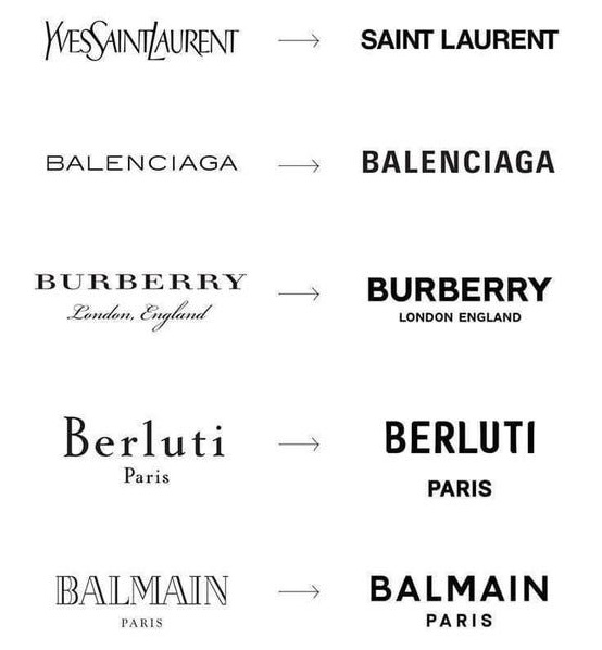
Logo Wars: the Sans Serif Epidemic and the Paradox of Modern Luxury
written by Shze Hui Tjoa and Foivos Dousos. March 2019
Medium.com
Via Edgar Miller Legacy -
A call to landmark the Kogen-Miller and Glasner Studios in Chicago.
Recently, the Kogen-Miller and Glasner Studios building was featured in a cover article in the Chicago Sun-Times on December 26, 2022, unfortunately concerning litigation stemming from allegations of improper management and neglect by the controlling majority owners of the property’s condo association. A second article in the same edition, The Glasner Studio, a true Chicago gem, accurately describes the building as an incredibly significant and unique architectural achievement in the City of Chicago, worth protecting.At the very least, sign the change.org petition. If possible, write a letter. Information on writing a letter to the Landmarks Commission
The Kogen-Miller Studios and the Glasner Studio make up one of the most remarkable apartment buildings in the City of Chicago, the State of Illinois, and the United States, and they are more than deserving of landmark designation to ensure their long-term protection.
Add your name and voice to the petition as we call on the Commission on Chicago Landmarks to designate the property at 1734 North Wells Street an official Chicago Landmark.
I visited the Studios in 2015 and the place is amazing. So very worth preserving and making available to the public someway, anyway. There is an album of 47 photos from that visit on my Flickr site - Kogen Miller Studios, Chicago IL
Just one example from the Flickr album -

A look on YouTube at a studio, Salem Stained Glass. I worked from about 2001-2004. I was the production manager there for over 2 years. The film is via Phill Hamby, who was early in his career at the studio when I was there. A good guy. He is the one working on the computer in the video. I was the one to introduce and set up the computer graphics they use in the studio. I'm glad it's helped them in the years since.
This aired as a part of UNC's Our State Series in November 2009. Al Priest, interviewed in the video, sadly passed away in 2018. Salem Stained Glass Studio is still around though.
Salem Stained Glass UNC TV Segment
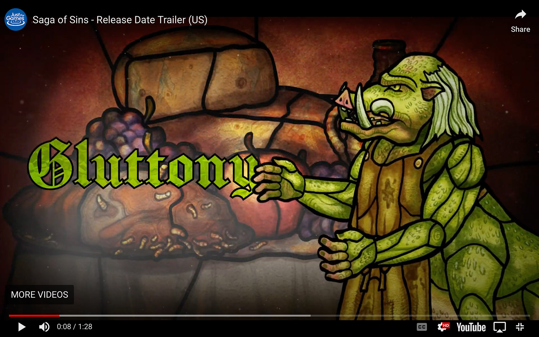
Saga Of Sins Brings Demon Hunting And Stained Glass Window Visuals To Switch In March
Quote -
"Anything for a weird life."
Zaphod Beeblebrox approaches the Total Perspective Vortex:
The Hitch-Hiker's Guide to the Galaxy (Fit the Eighth) By Douglas Adams
Grayson Perry's Full English Episode 2 Thu 3 Feb 2023
The video goes straight to a small bit of the full documentary, part of Grayson Perry’s series Full English. I have no comment other than that this is pub owner telling a story using four simple stained glass panels in his pub. I like small personal commissions like this.
Just a few minutes long.
An Artist Talk with Pinkie Maclure
From the Stained Glass Museum Youtube account
I'd seen a little of Pincki Maclure's work and liked it, but this talk has more detail. |
| http://www.krepcio.com/vitreosity/archives/Vitreosity_2004-2008-TOP32.pdf |
 |
Full article below the fold
With the advent of digital photography, the sheer number of images produced is virtually exploding. Though these digital images are easy to copy and share, they are not easy to archive. Where and how to archive digital images has become of paramount importance to anyone who uses images to market their work, and even more to those who wish to document their work for future generations. I will discuss the dangers ahead as it relates to stained glass images both in new work and restoration. Some advice on how to handle digital images in the short term will be given.
 |

Full article below the fold


Full article below the fold

Full article below the fold


